
How we fixed monday.com’s board a11y without a table rewrite
Half a year ago, I got pulled into one of those projects that looks “technical” on the surface – making the table in monday.com’s board accessible. But it is actually about people and how we orient ourselves.
As monday.com grows, we’re leaning harder into enterprise. And there, accessibility isn’t a bonus. It shows up in procurement checklists. The expectation is that the product will work for everyone on day one.
So I did the most honest thing I could do.
I turned on VoiceOver on my Mac, opened a board, and tried to “read” the thing that pays my salary.
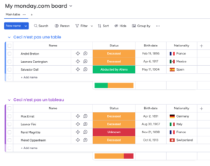
A board looks like a table. Rows, columns, headers. Familiar.
But the first time you experience it through a screen reader, it can feel like walking into a crowded room where everyone talks at once, nobody says their name, and the exits are hidden behind a decorative plant.
That moment is the whole story.
Because the uncomfortable truth was simple: our “table” is not a table. It is a sophisticated pile of divs.
So what does that mean?
It means the solution was never going to be “make it behave like a <table>“. The solution was to stop pretending and instead design a semantic structure that screen readers actually trust.
If you’ve ever shipped a complex UI that only looks like a native element, this post is for you. You’ll walk away with a practical blueprint you can adapt to your own product, without turning it into a multi-quarter rewrite.
Some context
Accessibility stops being aspirational when there’s a rollout date. It becomes a requirement and a deadline. And when the core workflow isn’t usable with a screen reader, the product isn’t usable.
The hard part wasn’t adding the appropriate ARIA labels, the mechanism screen readers use to interpret components. The hard part was overcoming the mismatch:
- visually: a table
- structurally: years of layered UI, dozens of cell types, and many complex interactions
- semantically: not a table at all
Screen readers don’t “see” layout. They build an accessibility tree from your DOM. Then they offer navigation on top of it based on landmarks – headings, lists, buttons, etc…
If your structure is noisy, the experience is noisy.
A quick detour: who is this for?
A surprising number of people rely on assistive tech. Roughly one in six people worldwide experiences a significant disability. Vision impairments alone affect billions.
And screen readers aren’t some niche power-user tool. They’re the default way many users navigate the web. They read content, yes. But more importantly, they let users move through the structure.
That’s the key.
If the structure is semantically sound, users can quickly scan and orient themselves. If it isn’t, every interaction becomes a guessing game.
Our effort focused on one thing: making the table content reachable and understandable through screen readers.
Why our earlier attempts didn’t work
We tried the classic move: force table semantics onto a non-table. role="grid", plus row, gridcell, columnheader. It maps nicely to what you see on screen.
But once we tested across real user setups, it stopped being convincing.
Some ARIA patterns are simply unreliable, especially across platforms. In our case, role="grid" looked reasonable on paper, but it didn’t hold up consistently on VoiceOver for iOS. And “orphaned” roles (a row without the right parent container) are one of those things that sometimes work just enough to trick you into shipping them.
“Ok, but screen readers can read tables. Why not just make it a table?”
They can. And they do it well.
When you use a real HTML <table>, screen readers can associate headers with cells. They can announce context like “Status, Done” because the browser gives them a stable semantic model.
But wrapping our existing DOM in tr / td wasn’t realistic for us.
Not because we don’t like semantic HTML. We do.
But our board “table” isn’t a simple matrix of text. Cells contain menus, dialogs, and other interactive components. We use virtualized rendering. And features like subitems complicate the row structure.
Changing the DOM wholesale would have been a high-risk refactor with unclear payoff.
So we made a different bet:
Instead of rewriting the world, we’d build a semantic layer that screen readers can navigate reliably.
Research & implementation
Before writing a single line of code, we tackled two unglamorous but critical tasks:
- We researched which navigation patterns screen readers consistently support.
- We committed to a testing matrix early, so we wouldn’t “accidentally” optimize for one environment.
Our primary targets were the combinations most common in real-world usage: JAWS and NVDA on Windows, and VoiceOver on macOS/iOS. Then we picked a strategy that sounds almost too humble for a product this complex.
Headings and lists
Most screen reader users don’t tab through every element. They jump:
- by heading level
- between lists
- across buttons and links
The question became:
Can a user quickly jump between groups and items, land inside an item, and understand each cell in context without getting lost?
If the answer is yes, the board becomes usable. So instead of building a fragile imitation of a table, we modeled the board as a semantic hierarchy that matches how screen readers already move.
navigating using headers
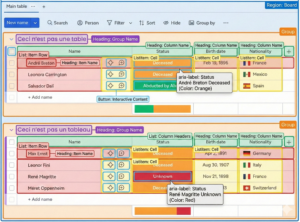
The spine: give the tree something to hang on to
A simplified version looks like this:
Board (region)
Group (group) -> Group name (heading)
Column headers -> Column name (heading)
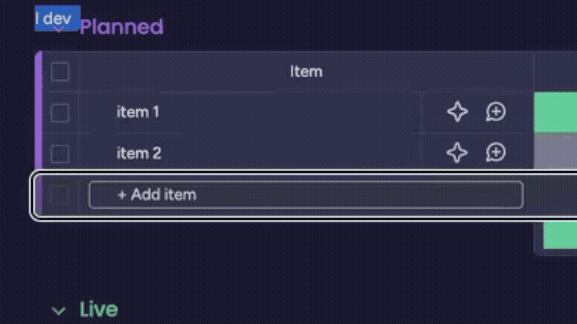
Item (list) -> Item name (heading)
Cells (listitem)
Interactive content (button)
Once this existed, VoiceOver navigation suddenly became… normal.
Heading shortcuts take you between groups and items.
List shortcuts take you through rows.
And navigating through the lists, you can read the actual table cells’ content.
navigating items through lists
The board stopped being a wall of “stuff”, and became a thing you could orient yourself inside.
The scalable rule: context by default
A cell without context is useless.
Hearing “done” means nothing if you don’t know which item and which column it belongs to.
So we decided the default accessible name of an interactive cell should include:
- the column name
- the item name
We already had stable IDs for the item name (row header) and the column title (column header). So we made every cell reference those two IDs by default.
const getDefaultA11yAttributes = (cellProps: any) => {
  const { columnId, itemId } = cellProps;
  const ariaLabelledBy =
      columnId && itemId ? `column-title-${columnId} name-cell-${itemId}` : undefined;

  return { 'aria-labelledby': ariaLabelledBy };
};
This is the kind of change that doesn’t look impressive in a demo.
But it scales. And it makes the announcement consistent across the board. We shipped the pattern for the most used cell types first, then expanded to the long tail. That kept the work measurable and gave screen reader users value early.
navigating the cells
When “default” isn’t enough
Some cells carry richer meaning than plain text.
Status is the obvious example. The label matters, but so does color. Sometimes there’s a note indicator.
For those cases, we keep a disciplined exception: a value-aware aria-label that explicitly describes what’s there.
const getStatusColumnA11yAttributes = (cellProps: any) => {
  const { value, itemName, columnName } = cellProps;


  const statusLabel = value?.label;
  const statusColor = value?.color.name  || '';
  const ariaLabel =
    itemName && columnName
      ? `${columnName} ${itemName} ${statusLabel || 'no status selected'} ${statusColor}`
      : undefined;


  return {
    'aria-label': ariaLabel,
  };
};
We proved the approach on a scoped slice, then rolled it out to the most-used cells first and expanded from there. That gave us a feedback loop early and made progress visible.
Empty cells are still information
A lot of boards are emptier than we care to admit.
For a screen reader user, silence is confusing. So we label empties explicitly with state + action, like: “Empty Status, Click to add Status.”
It’s small, but it removes doubt. And doubt is expensive when you’re navigating by audio only.
How we made it stick (so this doesn’t become my personal side quest)
If an accessibility strategy lives only in the heads of two developers, it’s not a strategy.
It’s a support queue.
So we documented the patterns as developer guidelines, with concrete examples and a clear expectation: manual screen reader testing is the source of truth.
Browser tools help, sure. They’re great for catching obvious issues.
But screen readers are where your assumptions go to get corrected.
What’s the status? And what’s next?
Today, we have two things that matter more than any individual PR:
- A semantic model for a complex, non-native “table” that screen readers can reliably navigate
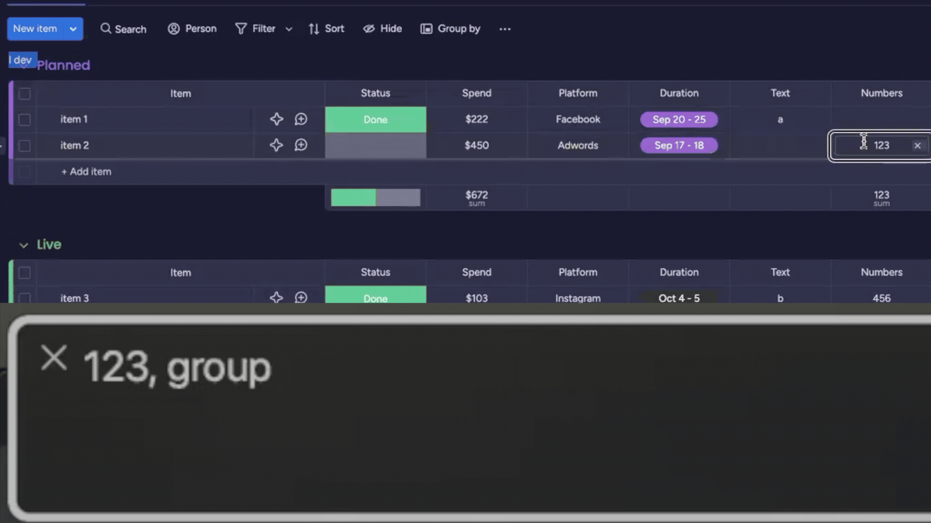
- A scalable labeling rule (
aria-labelledbyto stable IDs) that most cell types can inherit
Developers now have a concrete example of a product-wide accessibility solution they can reuse for other complex components. And the knowledge is in docs, not in tribal memory.
The main takeaway: don’t cosplay semantics
If your component is not a native semantic element, don’t cosplay it with fragile ARIA just because the visuals match.
Instead:
- Pick a semantic model that matches the interaction and is reliable across screen readers
- Design for navigation primitives (headings, lists, buttons), not pixels
- Make context scalable by referencing stable IDs (
aria-labelledby) - Test on a real matrix, across screen readers and browsers, because “it works on my machine” isn’t evidence of real accessibility coverage
Looking ahead (making it a framework)
We’re still building.
There are more cell types, more flows, more product requests that start with “oh right, that menu also needs a label”.
But the hard part is behind us.
We have a model. We have patterns. We have a shared language.
One thing I learned quickly: even good docs don’t always win against a deadline.
So we started building something that meets developers where they are.
An internal boards a11y agent.
Not “AI that magically fixes your column”.
More like a deterministic workflow that collects the right context: guidelines, examples from real fixes, and the rules we use to assess whether something is actually accessible.
You ask about a column type. It responds with a focused bundle of “here’s how we do it here”, including patterns already shipped in our codebase.
And suddenly, accessibility becomes less like folklore.
More like a paved road.
Closing the loop
After that first VoiceOver run, I remember closing my laptop and just sitting there for a minute.
Not because it was impossible. Because it was revealing.
A board that felt obvious to me was, for someone else, a crowded room. Weeks later, I ran the same experiment again. VoiceOver on. Board open.
And the room felt different. Fewer voices at once. Clearer names. Real doors. Actual exits.
Not perfect. But navigable. Trustworthy.
If you’re building something complex, especially something that only looks like a native element, what’s your “crowded room” component?
And what would happen if you stopped forcing it to be what it isn’t, and instead made it readable?


