How UILayoutGuide can help you manage UI complexity
Lay it out once, use it anywhere.
Do you know the default leading margin of a view controller’s root view on an iPhone 11 in landscape mode? If you don’t, that’s ok. The important thing to know is that the default leading margin is different on an iPhone 11 in landscape mode (64px) than it is on an iPhone 12 in portrait mode (20px) or on an iPhone 8 in portrait mode (16px).
Today iOS developers can deploy their code on multiple devices, from an Apple Watch to a Mac. A few years ago, life was simpler. There was one iPhone device, two orientations. With the introduction of iPadOS, Split View, and multi window support, there is now an infinity of window’s sizes iOS developers should adapt their UI code to. Devices come with edge cases, from top notch to bottom home bar.
Apple has introduced several APIs to help developers manage UI complexity. This article will show you what you should care about and what you should let UIKit deal with.
Constraints with fixed constants
When AutoLayout was introduced, developers started to convert hard coded frames into constraints. Back then, the unique iPhone’s default leading margin was 16px. Constraining a label’s leading anchor to a view controller’s root view would often include a fixed 16x offset:
label.leadingAnchor.constraint(equalTo: view.leadingAnchor, constant: 16).isActive = true
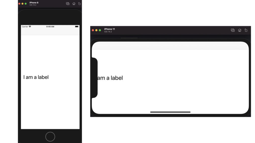
Unfortunately adding a fixed constant to a constraint in that way breaks the label’s layout on many devices and orientations. While that layout would work fine on an iPhone 8 in portrait mode, the label appears offscreen on an iPhone 11 in landscape mode:
Safe Area Layout Guide
When Apple released the iPhone X, the first iPhone to include a top notch and a bottom home bar, it also introduced safeAreaLayoutGuide, a new UIKit layout guide to safely layout views within the visible portion of its superview. Modify the constraint to take into account the safe area:
label.leadingAnchor.constraint(equalTo: view.safeAreaLayoutGuide.leadingAnchor).isActive = true
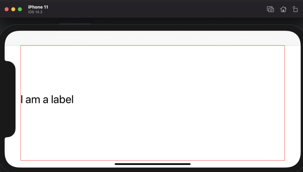
Now the label is rendered within the visible portion of its superview, highlighted in red:
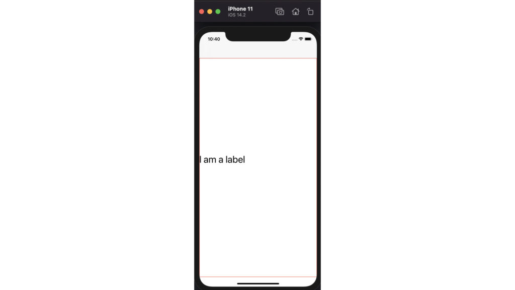
However the safe area is only part of the solution. If it helps to ensure UI elements stay visible in any situation, it doesn’t take into account a view’s margin. Flip the device into portrait mode and the constrained label is laid out at the screen edge. Indeed in portrait mode, views are unobscured by other contents and therefore the safe area fits along the screen vertical edges.
Layout Margins Guide
There are in fact two requirements for the label layout. First it should reside within its superview safe area so it stays unobscured in landscape mode. Second, the label should have a leading margin in portrait mode.
How about adding a fixed 16px margin to the safe area guide?
label.leadingAnchor.constraint(equalTo: view.safeAreaLayoutGuide.leadingAnchor, constant: 16).isActive = true
There are a couple of issues with that, one of them being the number 16 itself. 16px is the default horizontal margin for iPhone 8 in portrait mode. But on iPhone 11 the default horizontal margin goes up to 20px.
Why should you care about the system default margin? Because you live in an iOS world with iOS components that all use the system default margins. Suppose you have a navigation bar. Then you would probably want the label to have the same leading margin than the bar button items.
The layoutMarginsGuide, while older than the safeAreaLayoutGuide, will keep your content both unobscured and within the system margins. Set the label constraint once again but this time against the layout margins guide, highlighted in green in below screenshots.
label.leadingAnchor.constraint(equalTo: view.layoutMarginsGuide.leadingAnchor).isActive = true
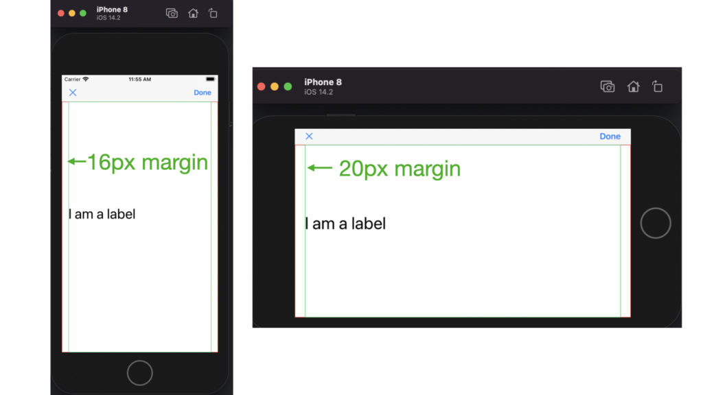
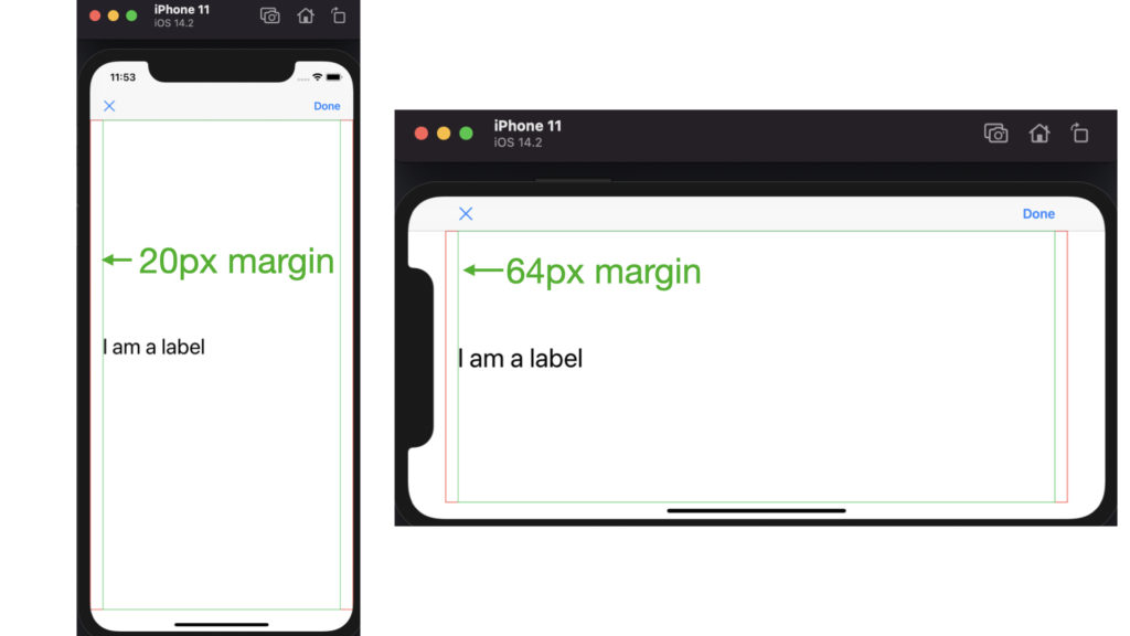
Any view’s layout margin can be modified through its layoutMargins property, or even better its directionalLayoutMargin property.
View controller’s root view default layout margins vary a lot across devices and orientations. I mean, this is the all point of this article, right? So modify them at your own risk:)
However setting a subview layout margin is a great alternative to position content. Subviews have a default spacing of 8px in each direction. Constrain your view to its container view layout margins guide, set the view’s directionalLayoutMargin property and you will never need to add a positive constant (or is it negative?) to a constraint ever again.
Readable Content Guide
It would not feel right to delve into layout guides without mentioning another layout guide the system provides, the readable content guide.
The readable content guide defines an area that can easily be read without forcing users to move their head to track the lines.
Open the medium app on an iPad in landscape mode, tap on an article, and you will see that the text is vertically centered into an area whose width is smaller than that of the layout margins guide.
Let me show you the three system layout guides on an iPhone 11 in landscape mode.
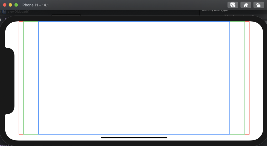
In this article, you have seen how to use UIKit layoutMarginsGuide to create an adaptive layout that responds to every size, edges and orientations. And by leveraging a view’s directionalLayoutMargin property, you should be able to constraint your UI without ever adding any fixed constants.

