From Prompts to Clicks: Shipping MCP Apps in Production
Lessons from building monday.com's first ChatGPT app
A user asks the chat, like ChatGPT or Claude, about their project status. Instead of paragraphs explaining which tasks are stuck, a battery widget appears. Monday.com’s familiar status overview, rendered directly in the conversation. They click the “Stuck” segment. A filtered table appears. One more click reveals the blocked item’s full context. Three interactions, zero context-switching, no copy-pasting between windows.
This is what becomes possible when AI tools return actual UI, not just text.
Chat is becoming the place where work happens. Not as a curiosity, but as a default. Users ask questions, make decisions, and take action without leaving the conversation. For product teams, this shifts how features reach people. Your product needs to show up where users already are, not as a link that pulls them away, but as something useful in the flow.
MCP Apps makes this concrete. It’s an extension to the Model Context Protocol that lets AI tools return interactive components alongside text. Products ship features into chat, and users ask, see, and act without leaving.
Terminology
- MCP Apps: A proposed MCP extension (SEP-1865) that standardizes interactive UI in MCP clients. Inspired by MCP-UI and the OpenAI Apps SDK.
- OpenAI Apps SDK: OpenAI’s framework for building apps in ChatGPT.
- MCP-UI protocol: The protocol specification for UI delivery.
- UI resource: An MCP resource returned by tools that renders as interactive UI.
- Host: A chat application supporting MCP Apps (e.g., ChatGPT, Claude).
- Flow: A user journey spanning prompts, tool calls, and UI interactions.
1. See It in Action
What makes this powerful isn’t the widget. It’s what happens next.
The user asks, “What item am I looking at?” The agent knows. It answers with the exact item selected on screen. No copying, no repeating context. The conversation stays grounded in what’s visible.
Then they ask the agent to assign unassigned items. It pulls context from connected tools like Gmail and Calendar, knows who’s available, and suggests smart assignments. The user confirms with a click.
Ask. See. Act. All without leaving the conversation.
2. The First Prototype
Before building anything new, we wanted to learn fast.
The first prototype was intentionally simple: we took an already-public monday.com dashboard and embedded it directly into Goose, the first agent host to support MCP-UI. We used a public view: a read-only dashboard link that works without authentication. This let us move fast. No new components, no custom UI. Just existing product views, shipped into a conversation to see what would work.
It worked well enough to show us what we didn’t know. The core flow held up, but authentication, lifecycle, and state management all surfaced questions we hadn’t considered. This wasn’t failure. It was exactly the kind of signal we needed early.
Ido Salomon and Liad Yosef, who created MCP-UI and contributed to this work at monday.com, presented this prototype as part of their MCP-UI talk at the MCP Dev Summit. It wasn’t a product announcement. It was a probe. The goal was to find the edges, not to ship.
From that starting point, patterns emerged. Here’s what we learned.
3. The Rules We Stopped Debating
Some of these came from early prototypes. Others came from research. Over time, observations became principles, and principles became constraints we stopped questioning.
UI in Chat Is Selective, Not Universal
The question that kept coming up wasn’t “what can we render?” It was “where does showing something actually beat describing it?”
We could display almost anything inside chat. But that didn’t mean we should. A battery widget? Immediately useful. One glance replaces a paragraph of status updates. A complex settings panel? Just noise that pulls attention away from the question at hand.
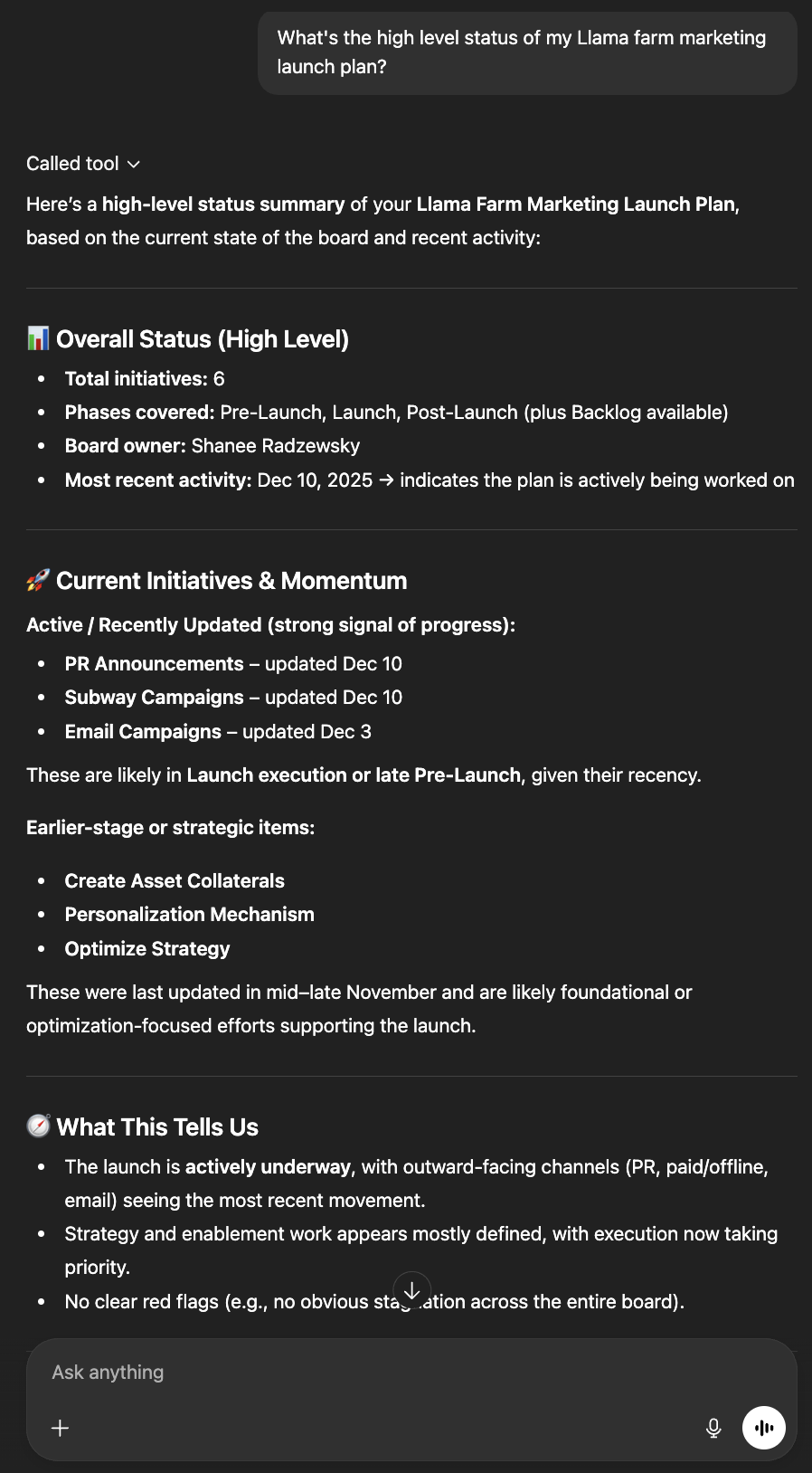
Before MCP Apps: Wall of text describing project status
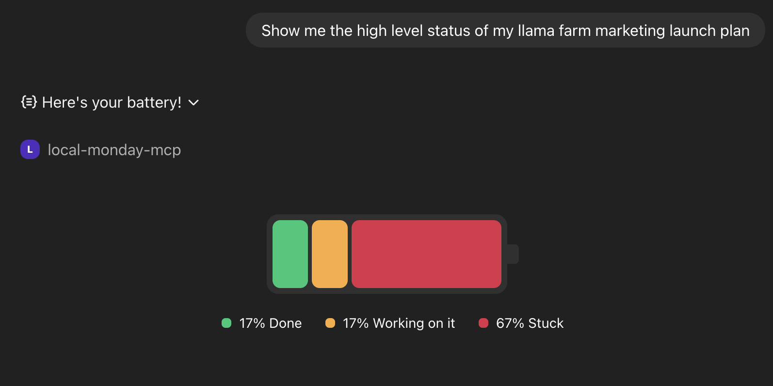
After MCP Apps: Battery widget with one-glance understanding
Not every response needs UI. Text is often enough. The wins came from finding moments where seeing genuinely beats reading, and adding components only there.
Just because you can show it doesn’t mean you should.
Temporary Lens, Not Destination
The widget exists for this question, in this moment.
Early on, we asked questions that felt important:
- Persistence: What if the user wants to come back to this view?
- Navigation: Should we let them move between boards?
- Complexity: Can we support all the features the full product has?
Then we found a better framing. The UI shouldn’t try to keep users engaged. It exists to support this question, right now. The conversation will move on. A new question will come. The widget’s job is to help and then step aside.
Once we accepted that UI in chat is ephemeral by nature, we stopped building features that the context didn’t need.
The widget’s job is to help and then step aside.
One Click Beats Another Prompt
Drilling down from an overview into specifics felt natural when it happened in place. The user clicks a segment of the battery widget, and the table appears filtered to what they care about. No re-prompting, no restating intent.
When we tried the same flow as a conversation (“show me the stuck items”), it felt like friction. The context was already on screen. Why describe what you can already see?
Clicks work for predictable next steps: click a status segment to see those items, click an item to see its details. For open-ended queries, prompts are clearer and more flexible.
When context is already visible, clicking beats re-describing.
Let the Agent Handle Data Flow
Traditional UI thinking says: give users controls. Dropdowns, filters, and configuration. In chat, the model is different.
Take filtering. In monday.com, users slice data themselves. Status dropdowns, person pickers, date ranges. But in chat, you don’t configure. You describe.
“Show me items assigned to me that are overdue.” The agent understands the intent, knows what filters exist, and returns exactly what’s needed. No dropdowns. No configuration.
What data to show is the agent’s job. The UI just displays it.
Why Full Apps in Chat Don’t Work
We never built this, but we discussed it enough to call it out: embedding a full application inside chat is a trap.
The temptation is real. If a widget works, why not a whole dashboard? But chat UI works because it serves a specific need in the moment. A full app fights against this. Load times slow, the experience becomes brittle, and the user’s attention splits between chatting and operating a nested application.
If the user needs a full application, link them there. Don’t stuff it into the conversation.
Components That Leverage LLM Context
This is what makes chat UI fundamentally different from UI anywhere else.
When users asked the agent to assign unassigned items, it didn’t just guess. The agent pulled context from connected tools like Gmail and Calendar, and suggested smart assignments based on who was actually free and relevant.
In a traditional app, you’d need to integrate Gmail, parse emails for project mentions, connect to Calendar, interpret availability, repeat for every source. With an agent, users bring their own connected tools. The LLM doesn’t need parsing logic. It just reads and understands.
UI in chat isn’t just “UI in a different place.” It’s UI that can lean on everything the agent already knows. The component becomes a surface for action. The intelligence comes from the context surrounding it.
Users bring their tools. The agent connects the dots.
4. Under the Hood
Here’s how those principles translated into code. The examples below are simplified for illustration.
The State Loop
MCP Apps follows a loop:
- User prompts
- Host invokes tool
- Tool returns text + UI resource
- Host renders widget
- User interacts
- Host invokes next tool
- …
Note: This shows a sequential flow for clarity. In practice, the host fetches the UI resource and starts rendering before the tool call fully returns.
For the battery flow:
- User asks: “How’s my project doing?”
- Host calls
show-batterytool - Tool returns text fallback + battery UI resource
- Host renders the battery widget
- User clicks the “Stuck” segment
- Widget sends interaction to host
- Host calls
show-tabletool with filter: stuck - Tool returns text + table UI resource
- Host renders the filtered table
Tool Design: What a Tool Returns
Every tool that shows UI returns three things:
- UI resource: The interactive component’s HTML, rendered where Apps are supported
- Structured content: Typed data that both the UI and the LLM can use
- Text content: Fallback for hosts that don’t support MCP Apps
{
  "content": [
    { "type": "text", "text": "Displaying the battery for board 123456" },
    {
      "type": "resource",
      "resource": {
        "uri": "ui://widget/mcpApps/show-battery.html",
        "mimeType": "text/html;profile=mcp-app",
        "text": "<!DOCTYPE html>..."
      }
    }
  ],
  "structuredContent": {
    "boardId": "123456",
    "statusCounts": { "stuck": 3, "working": 5, "done": 12 },
    "totalItems": 20
  }
}
The mimeType is the signal: text/html;profile=mcp-app tells the host this is a showable component, not just HTML content. If you’re using MCP-UI’s bridge, this is handled automatically. The bridge sets the mimeType and translates messages between protocols, so you don’t need to wire this up manually.
This keeps tools portable. The server returns both response types. The host shows whichever it supports. Same tool, different surfaces.
Note: MCP Apps is an evolving standard. See mcpui.dev for the current specification.
Host Abstraction: How It Runs Anywhere
Different hosts expose different SDKs, lifecycle events, and capabilities. ChatGPT has window.openai. Other clients have their own APIs or none at all. We needed components that worked everywhere without rewriting them per host.
The decision: push host-specific behavior behind a thin adapter layer from day one.
const hostApi = {
  sendFollowupQuestion: (prompt: string) => postMessage("prompt", { prompt }),
  setWidgetState: (state: unknown) => {
    if (!window.openai) {
      console.warn("SDK not found - ignoring");
      return;
    }
    return window.openai.setWidgetState(state);
  },
};
Components call hostApi.setWidgetState(). They don’t know or care whether that’s ChatGPT, Goose, or Claude underneath. When a richer API is available, we use it. When it’s not, we fall back gracefully.
This abstraction paid back immediately. Cross-host support became tractable from day one, not a painful retrofit later.
State Management: How Context Persists
The UI and the agent need to share context. When a user selects an item in the widget, the agent should know which item they’re looking at. Otherwise, “add an update to this item” becomes ambiguous.
In ChatGPT, we called window.openai.setWidgetState to sync the current selection. We ensured that the state property name matches the tool’s input schema. When they match, the host injects that state into the next tool invocation. That’s how “update this item” resolves.
In MCP Apps, widgets call app.updateModelContext (wrapping the ui/update-model-context message) to sync state with the agent’s context similarly.
Widget state after selection:
{
  "currentlySelectedItemIdForShowingUpdates": "12345678"
}
Merged into tool input on next call:
{
  "boardId": "123456",
  "currentlySelectedItemIdForShowingUpdates": "12345678"
}
A single “current item” key did more for reliability than any clever prompting. The agent always knows what the user is looking at. “Update it” has a clear referent. And when the widget loads with this key present, it can highlight that item immediately, restoring the user’s context without asking.
This bi-directional communication is powerful. Apps don’t just display. They talk back. The user clicks, the widget updates its state, the host captures that state, and the next tool invocation receives it as input. No re-asking, no ambiguity.
State needs to be boring. Simple keys, predictable shapes, obvious names. The less the agent has to reason about state structure, the more reliably it uses it.
Model Steering: How the Agent Picks the Right Tool
The agent doesn’t always know when to show UI.
If you have both a get-board-data tool and a show-board tool, the agent might choose inconsistently. One returns JSON, the other renders a widget, and the model doesn’t always know which you intended. Sometimes it fetches data when the user wants to see something. Sometimes it renders when data would have been enough.
The solution: explicit steering embedded in tool descriptions.
IMPORTANT: This is a UI DISPLAY tool – use it to RENDER visual
components for the user to see and interact with. Do NOT use
data-fetching tools when the user explicitly asks to 'show',
'display', 'visualize', or 'see' something visually.
Keywords matter. “Show me the board” should trigger the display tool. “Get the board data” should trigger the data tool. The descriptions make this explicit.
This points to a broader design question: should you have separate tools for data vs. display?
If you do, the steering matters. The model sees everything you expose. If tools overlap in purpose, the agent hesitates or chooses inconsistently. Clear boundaries, predictable naming, composable outputs. These matter more than clever abstractions.
We found it cleaner to return both from a single tool. The host shows whichever representation it supports. One tool, less ambiguity for the model.
Steering isn’t just about choosing the right tool. It’s also about what happens after. We added a re-display rule:
After adding an update to an item, you MUST display the table
AGAIN, even if the user did not ask you to.
This creates a closed-loop experience: action → immediate visual feedback. The user doesn’t need to ask “did it work?” They see the updated state automatically. Act, see, continue.
Streaming: When Valid Isn’t Ready
Tool input streaming introduced a subtle problem.
ChatGPT streams tool inputs incrementally. The data arrives piece by piece, syntactically valid at each step (it passes schema validation) but logically incomplete. An ID might reference an entity that hasn’t arrived yet. A required field might be missing from the first chunk. Rendering mid-stream can cause flicker, missing references, and inconsistent UI states.
This taught us an important distinction: streaming-valid is not semantically-ready. Just because the JSON parses doesn’t mean the data makes sense yet. Without guarding against this, IDs may be missing or reference entities that haven’t arrived yet. The schema validates, but the invariants the UI depends on aren’t yet satisfied.
The mitigation: treat semantic readiness as a gate, not just syntactic validity.
Practically, we used debouncing to wait for the stream to settle:
const debouncedSetRenderData = useRef(debounce((data) => setRenderData(data), 300));

const handleMessage = useCallback((event: MessageEvent) => {
  if (event.data?.type !== "ui-lifecycle-iframe-render-data") return;
  const { renderData } = event.data.payload;
  debouncedSetRenderData.current(renderData.toolInput);
}, []);

window.addEventListener("message", handleMessage);
Why 300ms? Long enough to let the stream settle, short enough to feel instant.
For complex cases, validate that required IDs reference valid entities before rendering. A loading skeleton can bridge the gap.
Streaming is one part of a broader theme. Model thinking time is expected. UI lag is not. Once something appears, it should be instant.
These patterns gave us a foundation: portable components, shared state, and reliable tool selection. But shipping required more than code. It required figuring out how to organize the work.
5. Shipping It
The technical patterns were necessary but not sufficient. Shipping also required figuring out how to organize the work and how to get it in front of users safely.
Who Owns What
This wasn’t a typical feature. It touched AI infrastructure, client frameworks, and product surfaces all at once. Early on, ownership wasn’t obvious. Was this an MCP platform concern? A client infrastructure problem? A product feature? The answer was “yes,” which made the split worth thinking through carefully.
We worked through that ambiguity and landed on a three-layer split:
MCP Platform owns the MCP server layer: reliable tool execution, shared foundations, and the plumbing that every tool depends on. Changes here are infrequent but high-impact.
Client Foundations owns the MCP Apps framework: the host abstraction, portable UI tooling, and the bridge that makes components work across different environments. This is where cross-cutting decisions live.
Product teams own specific components: the battery widget, the table view, and the item detail panel. Each team controls the user-facing behavior for their domain.
This split isn’t about org charts. It’s about keeping decisions local. Framework decisions happen once and apply everywhere. Product decisions can ship independently, without waiting for coordination. When the battery team wants to add a new interaction, they don’t need to touch the MCP server or the host abstraction. They just update their component.
The stable model emerged once we stopped asking “who should own this?” and started asking “who can move fastest without blocking others?” The principle: the team closest to the user should own the thing the user sees.
Shipping Safely
With new technology comes new territory to navigate. We didn’t want to break the experience for users who expected stable behavior while we were still learning what worked.
The solution was a beta toggle. We added a query parameter to the MCP server URL (?beta=true) that enabled the new UI tools. Users who wanted the evolving experience could opt in. Everyone else got the stable version.
This approach had a few advantages:
Reaching the right users. Instead of managing whitelists internally, we let users decide. The ones who opted in were self-selected power users: people who actively want the latest features and understand that things are evolving. They give better feedback because they’re paying attention.
No surprises. The default behavior stayed stable. Users who didn’t opt in never saw the new UI. This meant we could iterate aggressively without risking the experience for everyone.
The combination mattered: clear ownership let us move fast internally, and opt-in rollout let us gather feedback from early adopters without breaking things. Neither alone would have been enough.
This is how we started, and we expect to adapt as we learn more. The structure isn’t a finished playbook. It’s a foundation we can build on.
6. What Changes
The shift isn’t prettier chat responses. It’s that chat is no longer limited to text.
For product teams, this changes distribution. A component built once can appear in ChatGPT, Claude, or any host that supports the standard. Features travel to where users already are.
For users, the agent already knows your data: your emails, your calendar, your project history. When UI appears inside that conversation, it’s not a generic widget. It’s a component that understands your context in ways a standalone app never could.
We’re still early. MCP Apps is a new standard. But the principles (leveraging agent context, being selective about when UI helps, keeping components ephemeral) feel durable. They emerged from building, not from theory.
“Ask, see, act” is the design constraint we keep coming back to. When a component helps the user ask clearer questions, see things words can’t capture, and act without leaving, it earns its place in the conversation.
If you’re a monday.com user, you can enable UI components in ChatGPT to try this yourself. And if you’re building something similar, we’d love to hear about it. Check out mcpui.dev to get started.
Additional Resources
- MCP Apps Announcement – The official announcement of MCP Apps
- Model Context Protocol – The open standard for connecting AI to external systems
- MCP-UI Documentation – Guides and SDKs for building MCP Apps
- OpenAI Apps SDK – Documentation for building apps in ChatGPT
- monday.com MCP – Connect AI assistants to your monday.com account
- Goose – The first agent host to support MCP-UI

